The most elegant system diagram means nothing if the team builds something else entirely.
It was a Wednesday afternoon in a mid-sized product company in Chennai. Arvind, the software architect, had just wrapped up what he privately considered one of his better sessions. He’d spent three weeks designing the new order management system — clean bounded contexts, well-reasoned service boundaries, an event-driven backbone that he was genuinely proud of. The architecture document ran to twenty-two pages, complete with C4 diagrams at four levels of abstraction, a sequence diagram for every major flow, and a glossary that defined forty-three domain terms.
He’d presented it to the team for ninety minutes on a Tuesday. Questions were minimal. Everyone nodded.
Six weeks later, during a routine code review, Arvind pulled up the order service and felt something was wrong. He started reading. Then he opened the inventory service. Then the payment handler.
The team had built a monolith.
Not a bad monolith — they’d actually built it quite well. But they’d looked at the architecture document, found it difficult to parse under deadline pressure, made a collective judgment call that the service boundaries were probably optional guidelines rather than hard constraints, and shipped something that worked but wasn’t remotely what had been designed.
Arvind’s twenty-two pages had communicated one thing to him and an entirely different thing to five developers who needed to start writing code on Monday morning.
I’ve been in that room — sometimes as the architect, sometimes as the developer looking at a diagram that was clearly built with great care and making absolutely no sense to me. And after enough years of both experiences, I’ve arrived at a conclusion that feels uncomfortable to people who spend months on architecture documents:
A design that isn’t understood is not a design. It’s a document that exists in a folder somewhere.
Architecture is not what you draw. It’s what the team builds. And the gap between those two things is always — always — a communication problem.
What actually goes wrong
The failure mode is rarely malice or laziness. Developers don’t ignore architecture documents because they don’t care about good design. They ignore them because the documents are written for the author, not for the people who need to act on them.
Here’s what that looks like in practice. The architect understands the context behind every decision — the business constraints that ruled out option B, the operational concern that made option C dangerous, the future requirement that made the current design more complex than it needed to be today. All of that context lives in the architect’s head. Some of it makes it into the document. Almost none of it makes it into the team’s working understanding by the time they’re three sprints deep and making daily judgment calls.
So developers fill the gaps with their own reasoning. They see two services that seem to overlap and merge them because it’s simpler. They see an event bus they don’t fully understand and replace it with a direct API call because it’s faster to implement. Each individual decision is defensible in isolation. Collectively, they produce something that diverges from the intent in ways that compound over time.
This is not a failure of the developers. It’s a failure of communication.
The diagram problem
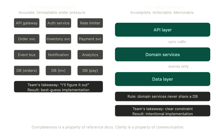
There’s a particular kind of architecture diagram that is technically correct and practically useless. It has twelve boxes, twenty-three arrows, five colours, two legend panels, and annotations in eight-point font. Every element is accurate. The diagram faithfully represents every component and every relationship in the system.
Nobody can read it in a sprint planning meeting. Nobody can hold it in their head while making a design decision under pressure. It answers questions nobody was asking and raises questions it doesn’t have room to answer.
Compare that to what a good architectural communication actually looks like:
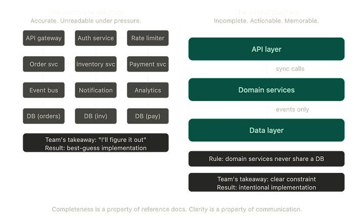
The complete diagram on the left isn’t wrong. It might even be useful as a reference — something you pull up when you need to trace a specific flow. But it is not communication. Communication is the diagram on the right: three layers, one directional constraint, one rule stated plainly. A developer can hold that in their head at 4 pm on a Friday when they’re deciding where a piece of logic belongs.
The measure of good architectural communication isn’t how much it contains. It’s how much of it survives the journey from the architect’s head to the developer’s daily decision-making.
Unread documents and why they stay unread
Most architecture documentation fails for a simple reason: it was written to record decisions, not to transfer understanding.
These are different jobs. Recording a decision means capturing what was chosen and the full context of why. That’s valuable — it’s your audit trail, your future reference, your onboarding material for someone who joins a year from now. But it’s not what a developer needs at the start of a sprint. What they need is: what are the constraints I have to work within, what decisions have already been made for me, and where am I free to use my own judgment?
A twenty-two-page document addresses the first need reasonably well. It answers the second need poorly because the signal is buried in the noise of completeness.
I’ve started thinking about architectural communication in two separate documents, each serving a different purpose. The first is the reference document— complete and detailed, the one you turn to when you need the full picture. The second is the working guide — one page maximum — with the three or four things every developer needs to know to make decisions that don’t contradict the architecture. The boundaries that cannot be crossed. The patterns that should be followed. The reasons are stated briefly so they’re understood rather than just obeyed.
The working guide is what actually gets read.
Misalignment is a communication symptom
When developers build something different from what was designed, the instinct is to look for a process failure. Someone didn’t read the document. Someone didn’t attend the review. Someone didn’t ask the right questions.
This framing puts the problem on the receiver. Usually, the problem is with the transmission.
I’ve started asking, after every architecture review session, whether the team can explain back to me — in their own words, without looking at the document — what the key constraints are and why they exist. Not a quiz, not an evaluation. Just a conversation. And the gaps that arise in that conversation are almost always gaps in my communication, not in their understanding.
If a developer can’t articulate why two services shouldn’t share a database in this system, it’s not because they’re not paying attention. It’s because that constraint wasn’t made clear enough, or connected to a consequence they could feel, or explained in terms that connected to something they already knew.
The architect’s job at that moment isn’t to repeat the explanation louder. It’s to find a better one.
What better communication actually looks like
A few things I’ve found genuinely useful after enough iterations of getting this wrong.
Talk in consequences, not just constraints. “Domain services should not share a database” is a rule. “If two services share a database, you can’t deploy one without risking the other, and what looks like a service boundary is actually a hidden coupling” is a reason. Reasons are remembered. Rules are resentful.
Make the architecture visible in the code, not just the documents. If the bounded contexts are real, the module structure should reflect them. If services have distinct responsibilities, the repository structure should make that obvious. When the architecture is legible in the codebase itself, developers live within the design choices rather than trying to remember them from a document they read three weeks ago.
Have architecture conversations early and often, not just at the start of a project. The sprint where a team starts implementing a new domain area is exactly when they need an architecture conversation — not to be handed a document, but to talk through what the design decisions mean for the specific work they’re about to do.
The philosophical bit, briefly
There’s a tendency in our industry to conflate the quality of an architecture with the sophistication of the design. The more elegant the abstraction, the better the architecture. The more complete the documentation, the more professional the architect.
I believe this gets it backwards.
The best architectural work I’ve been part of was not the most sophisticated. It was the most understood. Teams that knew why the system was shaped the way it was made better decisions, raised better questions, and built things closer to the intent — not because they were smarter, but because they had the context they needed to exercise judgment well.
Clarity is not the enemy of sophistication. It’s the thing that lets sophistication survive contact with a real team under real deadline pressure.
Arvind eventually rebuilt the misaligned services. It took two sprints of careful, frustrating rework. In the retrospective, he said something that stuck with me long after the meeting ended.
“I understood the design completely. I just assumed everyone else did too.”
That assumption — that understanding can be transmitted by documentation alone, that a diagram seen once in a meeting becomes shared knowledge — is probably the most expensive in software architecture.
So here’s what I’ll leave you with:
The next time you finish an architecture design, ask yourself not “is this correct?” but “could the person who will implement this explain it back to me tomorrow — and if they can’t, whose problem is that?”
The answer tells you whether you’ve done the design. Or the actual job.
I write about how software systems are built — and how the conversations around them shape everything the code becomes.
Comments
Loading comments…