Building A Resizable Sidebar Component With Persisting Width Using React & TailwindCSS
Hey There !
This article follows my previous one and is part of a series where I build a clone of the Spotify Web Player using React & TailwindCSS.
The first interesting challenge I came accross during this project is this nice resizable sidebar from the original Spotify Web Player site:
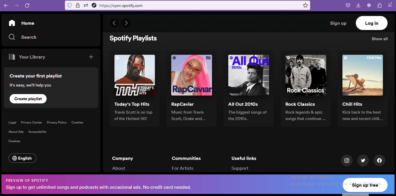
As you can see, the sidebar can be resized by the user and the whole layout resizes nicely to fit the new width. Also, when you refresh the page, the component remembers your preferences and remembers its lastly set width.
In this article, I’ll go over the solution I implemented for this feature, using React and TailwindCSS.
Project Setup
I use npm and vite to create a new react application:
npm create vite@latest resizable-sidebar -- --template react
Enter the newly created directory and install required packages with npm:
cd resizable-sidebar
npm install
Run the application in development mode and go to http://localhost:5173/ with your browser to make sure everything is installed properly:
npm run dev

Next, install and initialize TailwindCSS and its peer dependencies: postcss and autoprefixer.
npm install -D tailwindcss postcss autoprefixer
npx tailwindcss init -p
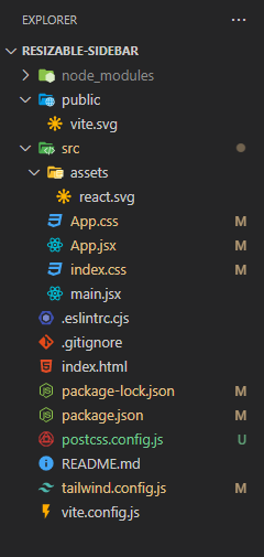
This is how the base folder structure of the project looks:
Next, delete everything inside the index.css file and replace it with the following:
@tailwind base;
@tailwind components;
@tailwind utilities;

html {
color-scheme: dark;
}
This will load all the elements we need to work with TailwindCSS and set the preferred color-scheme of the application to dark.
Everything set up, we can jump into the the implementation.
Markup and Styles
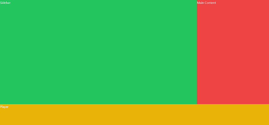
Let’s take another look at the layout of the Spotify web app:
We can identify 3 main parts here: the sidebar, the main content and a bottom bar which is normally used to display the player (when you’re logged).
The fastest and easisest way for me to achieve a layout like this is to use a CSS Grid. Let’s go.
First, delete everything in the App.jsx file and replace it with the following:
import  "./index.css";

export  default  function  App() {
return  <div className="w-full h-screen bg-black"></div>;
}
This creates a full-width and full-height black container for our layout.

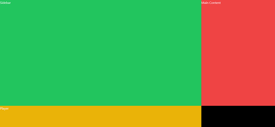
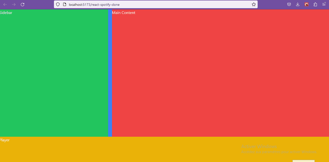
Next, Let’s setup this container as a grid and add 3 grid children for our 3 layout sections. I added background colors so we can see what’s going on:
import "./index.css";

export default function App() {
  return (
    <div className="w-full h-screen grid grid-cols-[min-content_auto] grid-rows-[5fr_1fr] bg-black">
      <div className="bg-green-500">Sidebar</div>
      <div className="bg-red-500">Main Content</div>
      <div className="bg-yellow-500">Player</div>
    </div>
  );
}

The tailwind grid class makes our container a grid container.
The grid-cols-[min-content_auto] class creates 2 columns for the grid. The first column is set up to take up whatever space that is needed to fit its content (min-content). And the second just fills the available remaining space (auto). This way, when the width of the first column (containing the Sidebar) changes, the second column of the grid will automatically resize.
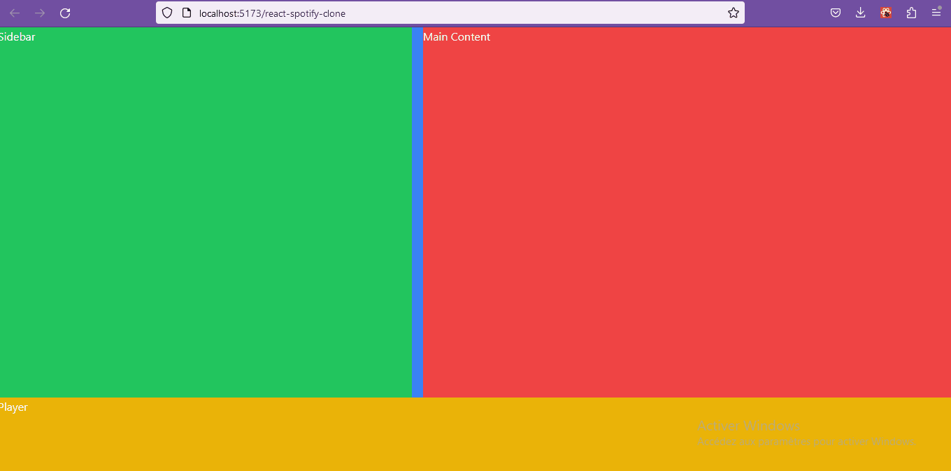
We can manually set a width to the sidebar to see that in action:
<div className="w-[1000px] bg-green-500">Sidebar</div>
The grid-rows-[5fr_1fr] class creates two rows in the grid, the first being 5 times as tall as the second (5 fractions, 1fraction). The second row holds the Player. But, there’s a slight problem: we would like it to fill up the whole screen width. We can do that by adding the col-span-2 tailwindcss class to the Player container:
<div className="col-span-2 bg-yellow-500">Player</div>
This is the App.jsx at the end of this first step:
import  "./index.css";

export  default  function  App() {
return (
<div className="w-full h-screen grid grid-cols-[max-content_auto] grid-rows-[5fr_1fr] bg-black">
<div className="bg-green-500">Sidebar</div>
<div className="bg-red-500">Main Content</div>
<div className="col-span-2 bg-yellow-500">Player</div>
</div>
);
}
User-Resizability
When the Sidebar’s width changes, the layout follows, that’s great. Now we need to enable the user to resize the sidebar himself using a handle on the right side of the component:
To achieve this, we are going to need a little bit more of JavaScript to come into play. First of all, let’s extract our Sidebar to its own separate component so that we can focus on it.
Create a Sidebar.jsx file in the src folder and move the Sidebar container inside of it:
export  default  function  Sidebar() {
return  <div className="bg-green-500">Sidebar</div>;
}
Then use the newly created component in place of the container in the App.jsx file:
import  Sidebar  from  "./Sidebar";
import  "./index.css";

export  default  function  App() {
return (
<div className="w-full h-screen grid grid-cols-[max-content_auto] grid-rows-[5fr_1fr] bg-black">
<Sidebar />
<div className="bg-red-500">Main Content</div>
<div className="col-span-2 bg-yellow-500">Player</div>
</div>
);
}
Let’s store the component’s width as a state variable (in pixels) so that it will re-render whenever we change the width:
const [width, setWidth] = useState(350);
We’ll make use of this variable through the style attribute:
<div className="bg-green-500" style={{ width: `${width / 16}rem` }}>
Sidebar
</div>
Note: The width is divided by 16 so that it can be set using rem instead of pixels.
Next, we are going to create the resize handle.
Since the handle needs to be right next to the Sidebar and have the same height, I find it easy to create a higher level flex container that will hold both the Sidebar content and the handle:
import { useState } from  "react";

export  default  function  Sidebar() {
const [width, setWidth] = useState(450);

return (
<div className="flex">
<div style={{ width: `${width / 16}rem` }} className="bg-green-500">
Sidebar
</div>

{/* Handle */}
<div className="w-4 cursor-col-resize bg-blue-500" />
</div>
);
}

Okay, nice.
Now, the way a user resizes the sidebar is by clicking on the handle and then moving left or right with the mouse.
To implement this, I used a combination of the mousedown, mouseup and mousemove DOM events.
Let’s start by listening to mouse movements by attaching an event listener to the window when the component is mounted. For that, we are going to use the useEffect hook:
useEffect(() => {
window.addEventListener("mousemove", (e) => {
console.log(e.movementX);
});
}, []);
Now if you open your browser’s console, you’ll see value printed each time you move you mouse over the application window.
The e.movementX variable is the displacement (in pixels) of the mouse on the x axis (horizontally).
Now if in the callback function, instead of printing in the console, we set the width like this:
useEffect(() => {
window.addEventListener("mousemove", (e) => {
setWidth((previousWidth) => previousWidth + e.movementX / 2);
});
}, []);
We get this:
Now the Sidebar resizes, following your mouse movement on the window, we are almost done here!
We need to actually resize the Sidebar only when the handle is being clicked on. To achieve this, one solution is to create a boolean variable that will indicate whether or not the user has the handle clicked on. We are in a sense going to create a “resize mode”.
Now, the boolean that we are going to create doesn’t have to cause component re-render when it changes because it doesn’t affect the appereance of the Sidebar, which means the useState hook is certainly not the way to go. However, it will be updated by the component and needs to keep its value through re-renders, so a regular variable created inside or outside the component would not work. In this case, we have to use the useRef hook:
const isResized = useRef(false);
Now, in our callback function, we can just ignore the mouse movements when the component is not being resized:
useEffect(() => {
window.addEventListener("mousemove", (e) => {
if (!isResized.current) {
return;
}

setWidth((previousWidth) => previousWidth + e.movementX / 2);
});
}, []);
Now, when do we actually enter the “resize mode” ? When the user clicks and holds the handle. Let’s implement that.
First, we need to set the isResized variable to true when we “mouse down” on the handle:
{/* Handle */}
<div
className="w-4 cursor-col-resize bg-blue-500"
onMouseDown={() => {
isResized.current = true;
}}
/>
Now, when we click on the handle, we enter the resize mode and the Sidebar follows the mouse movements. However, we never exit resize mode, even when we release the mouse click. To address that, we can add another event listener on the window in the useEffect, that will listen to “mouse up” events (when you release the mouse button after a “mouse down”) and exit from the resize mode by setting the isResized variable to false:
window.addEventListener("mouseup", () => {
isResized.current = false;
});
Everything is working fine now:
The Sidebar.jsx file looks like this so far:
import { useState, useEffect, useRef } from  "react";

export  default  function  Sidebar() {
const [width, setWidth] = useState(450);
const isResized = useRef(false);

useEffect(() => {
window.addEventListener("mousemove", (e) => {
if (!isResized.current) {
return;
}

setWidth((previousWidth) => previousWidth + e.movementX);
});

window.addEventListener("mouseup", () => {
isResized.current = false;
});
}, []);

return (
<div className="flex bg-green-500">
<div style={{ width: `${width / 16}rem` }}>Sidebar</div>

{/* Handle */}
<div
className="w-4 cursor-col-resize bg-blue-500"
onMouseDown={() => {
isResized.current = true;
}}
/>
</div>
);
}
The last thing to do in this step is to constrain the width to a minimum and a maximum. Let’s first create some variables outside of the component function:
const [minWidth, maxWidth, defaultWidth] = [200, 500, 350];
Change the default value in useState and replace it with our new defaultWidth variable:
const [width, setWidth] = useState(defaultWidth);
Now, we just have to check if the new width is in the correct range before changing the width in our mousemove event callback. If not, we just return the current width:
window.addEventListener("mousemove", (e) => {
if (!isResized.current) {
return;
}

setWidth((previousWidth) => {
const newWidth = previousWidth + e.movementX / 2;

const isWidthInRange = newWidth >= minWidth && newWidth <= maxWidth;

return isWidthInRange ? newWidth : previousWidth;
});
});
Now, everything is working fine! 🚀
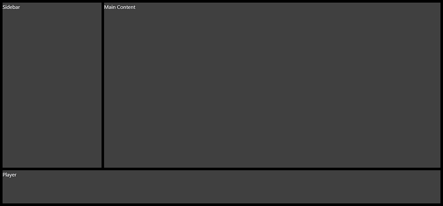
We can get rid of these horrible flashy colors and try to get closer to the original design.
App.jsx
import  Sidebar  from  "./Sidebar";
import  "./index.css";

export  default  function  App() {
return (
<div className="w-full h-screen grid grid-cols-[max-content_auto] grid-rows-[5fr_1fr] gap-y-2 p-2 bg-black">
<Sidebar />
<div className="bg-neutral-700">Main Content</div>
<div className="col-span-2 bg-neutral-700">Player</div>
</div>
);
}
Sidebar.jsx
import { useState, useEffect, useRef } from  "react";

const [minWidth, maxWidth, defaultWidth] = [200, 500, 350];

export  default  function  Sidebar() {
const [width, setWidth] = useState(defaultWidth);
const isResized = useRef(false);

useEffect(() => {
window.addEventListener("mousemove", (e) => {
if (!isResized.current) {
return;
}

setWidth((previousWidth) => {
const newWidth = previousWidth + e.movementX / 2;

const isWidthInRange = newWidth >= minWidth && newWidth <= maxWidth;

return isWidthInRange ? newWidth : previousWidth;
});
});

window.addEventListener("mouseup", () => {
isResized.current = false;
});
}, []);

return (
<div className="flex">
<div style={{ width: `${width / 16}rem` }} className="bg-neutral-700">
Sidebar
</div>

{/* Handle */}
<div
className="w-2 cursor-col-resize"
onMouseDown={() => {
isResized.current = true;
}}
/>
</div>
);
}
Note: It’s important for the effect to work to remove the handle’s background:
{/* Handle */}
<div
className="w-2 cursor-col-resize"
onMouseDown={() => {
isResized.current = true;
}}
/>
Persisting Width
At this stage, if you refresh the page, the Sidebar returns to the default width passed to the useState hook. We need a way to store the lastly set width and to recover it when coming back to the app. We are going to use the local storage.
The local storage allows us to store key/value pairs in the browser and to retrieve them when needed. We are going to store the Sidebar’s width whenever it changes. To do so, we can add another useEffect, this time with the width as a dependency, so that the callback will be executed everytime the width changes:
useEffect(() => {
localStorage.setItem("sidebarWidth", width);
}, [width]);
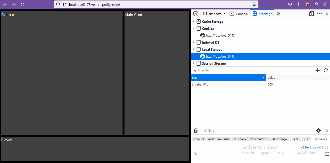
Now, to retrieve this value when the component mounts, we are going to use the localStorage.getItem method:
const [width, setWidth] = useState(
parseInt(localStorage.getItem("sidebarWidth")) || defaultWidth
);
That’s it! We built a resizable Sidebar component that maintains its width over page refreshes.
As I said in the beginning, this is one of the many cool challenges I faced while building a Spotify Web Player Clone with React & TailwindCSS.
When I’m writing this article, the project is still in development. You can checkout the current state of development here. You can also check out the code here.
Thanks for reading and see you next time ! 🚀
Comments
Loading comments…