Creating a Modern Carousel in Jetpack Compose Using Material Design 3
Recently, while practicing with Jetpack Compose and integrating it with Material Design 3, I stumbled upon this beautiful Carousel component: Material Design 3 Carousel Guidelines. In search of official documentation, I realized that, as of now, Android has not created a Composable that supports these features. Therefore, I decided to undertake my own implementation, utilizing what Jetpack Compose has to offer.
If you’re already familiar with Jetpack Compose, you probably know where I’m heading with this — I’m using the powerful AndroidView Composable. If you're not familiar, let me give you a brief overview: AndroidView is a component that allows you to load any Android view, from ImageView and TextView to ViewPager and beyond, right within a Composable. Quite cool, right?
Upon delving into the Carousel documentation Material Components for Android — Carousel, I discovered that there already exists an XML component capable of achieving this behavior. Without further ado, here is the implementation:
The first thing we need to do is create an XML file, which will serve as the representation of our item within the RecyclerView. It’s quite a simple task. The innovative part is that we will add a MaskableFrameLayout container, and this will be responsible for handling the images and how they are displayed in the carousel.
<?xml version="1.0" encoding="utf-8"?>
<com.google.android.material.carousel.MaskableFrameLayout xmlns:android="http://schemas.android.com/apk/res/android"
    android:layout_width="200dp"
    android:layout_height="match_parent"
    android:layout_marginStart="8dp"
    android:layout_marginEnd="8dp"
    android:id="@+id/maskable"
    xmlns:app="http://schemas.android.com/apk/res-auto"
    app:shapeAppearance="?attr/shapeAppearanceCornerLarge">

    <ImageView
        android:layout_width="match_parent"
        android:id="@+id/carouselImageView"
        android:scaleType="centerCrop"
        android:paddingEnd="16dp"
        android:layout_height="match_parent"
        android:contentDescription="infoimage" />

</com.google.android.material.carousel.MaskableFrameLayout>
After this, we need to create an Adapter that will manage the loading of our images and handle a few other details. Therefore, it’s important to add the Coil library to your project.
I won’t copy the entire code of the adapter here; instead, I’ll focus on the binding part, which is the most relevant:
fun bind(item: String) = with(itemView) {
            val maskable = itemView.findViewById<MaskableFrameLayout>(R.id.maskable)
            val imageView = itemView.findViewById<ImageView>(R.id.carouselImageView)
            val newShape = ShapeAppearanceModel().toBuilder().setAllCornerSizes(48f).build()
            maskable.shapeAppearanceModel = newShape
            imageView.load(item){
                crossfade(true)
                transformations(RoundedCornersTransformation(80f))
            }
        }
Here, accessing our view references is quite manual, so I recommend using view binding for a more streamlined approach.
Let’s break down the code. Initially, we retrieve our container, which is the MaskableFrameLayout, and the ImageView.
Next, you’ll notice there’s a newShape variable. I used this to define the border of our MaskableFrameLayout when it's in an unselected state. For some reason that I still don't fully understand, the attribute
app:shapeAppearance="?attr/shapeAppearanceCornerLarge"
It turns out that the attribute isn’t automatically recognized, so it must be set manually, which is a bit unusual but feasible.
After addressing this, we assign the shape to our MaskableFrameLayout. Finally, and just as importantly, we load our image using Coil. Note that in the code, a transformations is added, as the ImageView doesn't have any corner properties or similar attributes.
With our adapter now ready, the next step is to add it to our RecyclerView. This is where the magic of AndroidView comes into play, as we simply invoke it from our Composable.
val adapter = CarouselAdapter()
val carouselLayoutManager = CarouselLayoutManager()
AndroidView(
factory = { context ->
val recycler = RecyclerView(context)
recycler.clipChildren = false
recycler.clipToPadding = false
val snapHelper = CarouselSnapHelper()
snapHelper.attachToRecyclerView(recycler)
recycler.layoutManager = carouselLayoutManager
recycler.adapter = adapter
recycler
},
update = {
adapter.submitList(listOf(
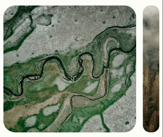
"https://images.pexels.com/photos/19534459/pexels-photo-19534459/free-photo-of-aerial-view-of-a-river-winding-through-a-green-wetland.jpeg?auto=compress&cs=tinysrgb&w=1260&h=750&dpr=1",
"https://images.pexels.com/photos/19780240/pexels-photo-19780240/free-photo-of-a-forest-with-trees-and-fog-in-the-background.jpeg?auto=compress&cs=tinysrgb&w=1260&h=750&dpr=1","" +
"https://images.pexels.com/photos/9201513/pexels-photo-9201513.jpeg?auto=compress&cs=tinysrgb&w=1260&h=750&dpr=1",
"https://images.pexels.com/photos/1805164/pexels-photo-1805164.jpeg?auto=compress&cs=tinysrgb&w=1260&h=750&dpr=1",
"https://images.pexels.com/photos/5971314/pexels-photo-5971314.jpeg?auto=compress&cs=tinysrgb&w=600"))
},
modifier = Modifier
.fillMaxWidth()
.fillMaxHeight(0.5f)
.padding(vertical = 16.dp)
)
With our RecyclerView now set up, we can assign the adapter and our crucial CarouselLayoutManager, which creates the carousel-like movement.
Additionally, we attach a component called CarouselSnapHelper to the RecyclerView. What this does is ensure that when an item is scrolled, it stops right at the end of the image's movement.
In our lambda function update = {}, we pass the list of image URLs.
Lastly, it’s important to specify the space our RecyclerView will occupy on our screen.
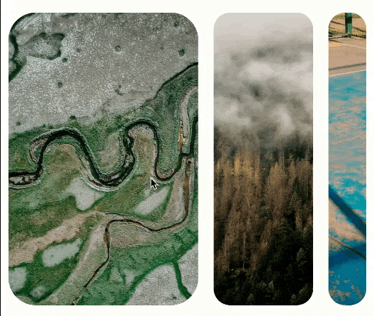
With all these elements in place, here is the final result in our app.
Carousel con Multi-browse strategy:
It’s worth noting that the carousel offers greater flexibility. For instance, if we pass the HeroCarouselStrategy class to our carouselLayoutManager.
val carouselLayoutManager = CarouselLayoutManager(HeroCarouselStrategy())
We will achieve the following behavior:
Corusel con HeroCarouselStrategy:
As you can see, what we’ve created is quite dynamic.
I hope this brief guide/tutorial will be useful for developers looking to implement this in Jetpack Compose. Thank you for reading!
Comments
Loading comments…