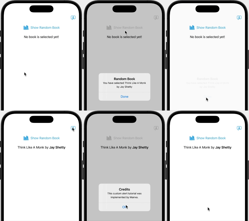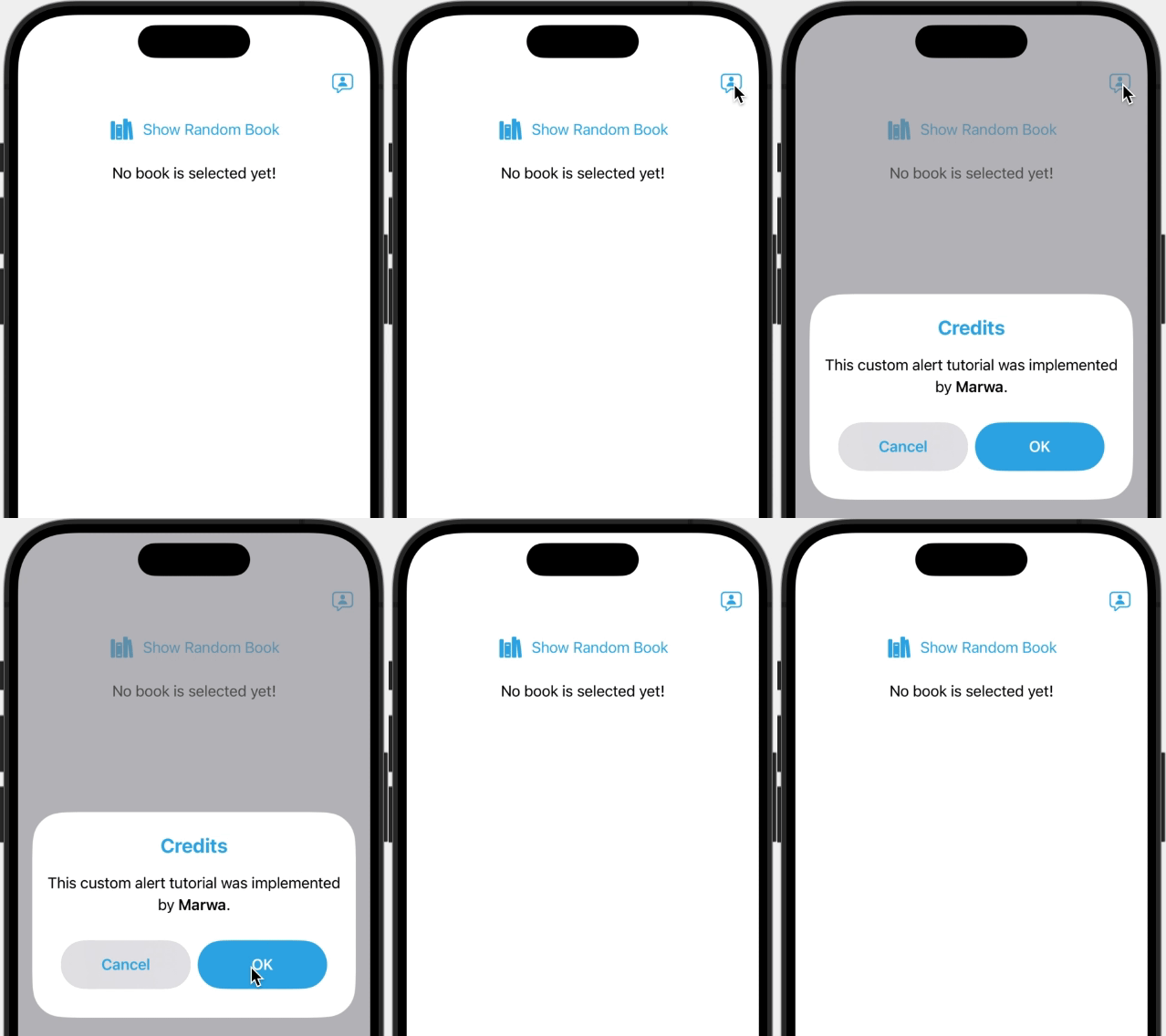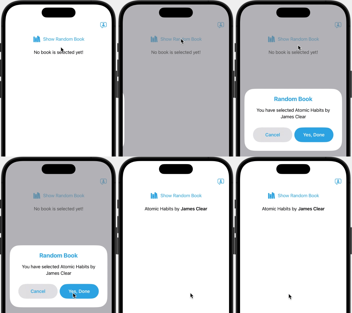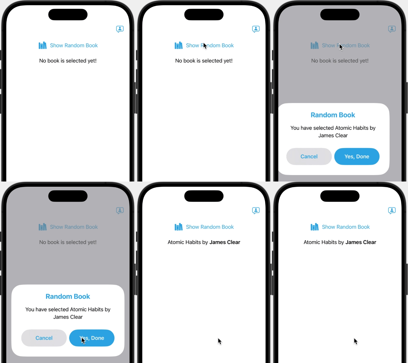
The purpose of this tutorial is implement custom alert view and use it the same way you would use Apple’s alert(_:isPresented:actions:message:) and alert(_:isPresented:presenting:actions:message:) functions on your Views, except for actions, I will be implementing one action with a default Cancel action.
And so instead of calling alert(_:isPresented:presenting:actions:message:) and alert(_:isPresented:actions:message:) like follows:
/// content ...
.alert(
    "Random Book",
    isPresented: $showAlert,
    presenting: randomBook
) { book in
    Button("Yes, Done") {
        selectedBook = book
    }
} message: { book in
    Text("You have selected \(book.title) by \(book.author)")
}
.alert(
    "Credits",
    isPresented: $showCreditAlert
) {
    Button("OK") {}
} message: {
    Text("This custom alert tutorial was implemented by **Marwa**.")
}
Apple’s Alert:

We can call customAlert(_:isPresented:presenting:actionTextKey:action:message:), and customAlert(_:isPresented:actionTextKey:action:message:) like follows:
/// content ...
.customAlert(
    "Random Book",
    isPresented: $showAlert,
    presenting: randomBook,
    actionTextKey: "Yes, Done"
) { book in
    selectedBook = book
} message: { book in
    Text("You have selected \(book.title) by \(book.author)")
}
.customAlert(
    "Credits",
    isPresented: $showCreditAlert,
    actionText: "OK"
) {
    // OK Action
} message: {
    Text("This custom alert tutorial was implemented by **Marwa**.")
}
Custom alert:

Let’s Start 👩🏻💻:
Feel free to download starter project here, if you want to follow along — it is just a simple ContentView to test our custom alert — , or make the changes in your own project.
TL;DR
If you don’t want the explanation part, feel free to jump to the end of the article, you will find the full source code, download or copy
CustomAlertView.swiftandView-CustomAlert.swiftfiles and customizeCustomAlertViewto match your app’s look and feel, or even add your ideas to match your need.
❶ First, Create new SwiftUIView file named CustomAlertView, in struct header define generic type T that conforms to Hashable, and generic type M that conforms to View, and then declare the following variables:
isPresented: A binding to a Boolean value that determines whether to present the alert.titleKey: The key for the localized string that describes the title of the alert.actionTextKey: The key for the localized string that describes the text of action button.data: An optional binding of generic typeTvalue, this data will populate the fields of an alert that will be displayed to the user.actionWithValue: The alert’s action given the currently available data.messageWithValue: A ViewBuilder returning the message for the alert given the currently available data.action: Returning the alert’s action.message: A ViewBuilder returning the message for the alert.
struct CustomAlertView<T: Hashable, M: View>: View {
    // 1.
    @Binding private var isPresented: Bool
    // 2.
    @State private var titleKey: LocalizedStringKey
    // 3.
    @State private var actionTextKey: LocalizedStringKey

    // 4.
    private var data: T?
    // 5.
    private var actionWithValue: ((T) -> ())?
    // 6.
    private var messageWithValue: ((T) -> M)?

    // 7.
    private var action: (() -> ())?
    // 8.
    private var message: (() -> M)?

    // TODO: init()
}
In case data is not nil, then we will return actionWithValue and messageWithValue, otherwise, we will return action and message — without a value.
❷ Next, we are going to create two different initializers for CustomAlertView.
In the first initializer, because we have data of generic type T, we will define data, actionWithValue, and messageWithValue.
action and message will be nil in this case.
init(
    _ titleKey: LocalizedStringKey,
    _ isPresented: Binding<Bool>,
    presenting data: T?,
    actionTextKey: LocalizedStringKey,
    action: @escaping (T) -> (),
    @ViewBuilder message: @escaping (T) -> M
) {
    _titleKey = State(wrappedValue: titleKey)
    _actionTextKey = State(wrappedValue: actionTextKey)
    _isPresented = isPresented

    self.data = data
    self.action = nil
    self.message = nil
    self.actionWithValue = action
    self.messageWithValue = message
}
For the second initializer, add an extension to CustomAlertView, where T equals to Never.
In this initializer where data is not available, we will define action and message.
data and actionWithValue, and messageWithValue will be nil.
Note: the additional constraint where T == Never, can be added either on extension or on init().
extension CustomAlertView where T == Never {
    init(
        _ titleKey: LocalizedStringKey,
        _ isPresented: Binding<Bool>,
        actionTextKey: LocalizedStringKey,
        action: @escaping () -> (),
        @ViewBuilder message: @escaping () -> M
    ) where T == Never {
        _titleKey = State(wrappedValue: titleKey)
        _actionTextKey = State(wrappedValue: actionTextKey)
        _isPresented = isPresented

        self.data = nil
        self.action = action
        self.message = message
        self.actionWithValue = nil
        self.messageWithValue = nil
    }
}
The reason I separated actionText and action, instead of implementing action(s) as @ViewBuilder and send it from caller View the same way you would send it to Apple’s alert, is that I wanted the action button to be controlled by the custom alert and not by the caller.
Also I wanted it to be specifically one action button.
Feel free to add your ideas to make it more customizable and flexible.
Let’s continue with the UI
❸ Inside body, add the following ZStack that will contain the gray background and the alert VStack:
ZStack {
    Color.gray
        .ignoresSafeArea()
        .opacity(isPresented ? 0.6 : 0) // Choose the opacity you like.
    VStack {
        // TODO: Alert
    }
    .padding()
}
.ignoresSafeArea()
.zIndex(.greatestFiniteMagnitude)

Add the following inside the  `VStack`:
If  `data`  and  `messageWithValue`  is conditionally unwrapped, return  `messageWithValue(data)`, otherwise return  `message()`.

VStack {
    /// Title
    Text(titleKey)
        .font(.title2).bold()
        .foregroundStyle(.tint)
        .padding(8)

    /// Message
    Group {
        if let data, let messageWithValue {
            messageWithValue(data)
        } else if let message {
            message()
        }
    }
    .multilineTextAlignment(.center)

    /// Buttons
    HStack {
        CancelButton
        DoneButton
    }
    .fixedSize(horizontal: false, vertical: true)
    .padding()
    .frame(maxWidth: .infinity)
}
.padding()
.frame(maxWidth: .infinity)
.background(.background)
.cornerRadius(35)
And the following for cancelButton and DoneButton:
In DoneButton’s action, if data and actionWithValue is conditionally unwrapped, return actionWithValue(data), otherwise return action().
var CancelButton: some View {
    Button {
        isPresented = false
    } label: {
        Text("Cancel")
            .font(.headline)
            .foregroundStyle(.tint)
            .padding()
            .lineLimit(1)
            .frame(maxWidth: .infinity)
            .background(Material.regular)
            .background(.gray)
            .clipShape(RoundedRectangle(cornerRadius: 30))
    }
}

var DoneButton: some View {
    Button {
        isPresented = false
        if let data, let actionWithValue {
            actionWithValue(data)
        } else if let action {
            action()
        }
    } label: {
        Text(actionTextKey)
            .font(.headline).bold()
            .foregroundStyle(Color.white)
            .padding()
            .multilineTextAlignment(.center)
            .frame(maxWidth: .infinity)
            .background(.tint)
            .clipShape(RoundedRectangle(cornerRadius: 30.0))
    }
}
Now, the UI is ready.
❹ Next, we are going to add two customAlert functions in View extension, the first overload will include T that conforms to Hashable, and M that conforms to View.
The second overload will only include M that conforms to View.
extension View {
    func customAlert<M, T: Hashable>(
        _ titleKey: LocalizedStringKey,
        isPresented: Binding<Bool>,
        presenting data: T?,
        actionText: LocalizedStringKey,
        action: @escaping (T) -> (),
        @ViewBuilder message: @escaping (T) -> M
    ) -> some View where M: View {

        fullScreenCover(isPresented: isPresented) {
            CustomAlertView(
                titleKey,
                isPresented,
                presenting: data,
                actionTextKey: actionText,
                action: action,
                message: message
            )
            .presentationBackground(.clear)
        }
        // TODO: Disable fullScreenCover transition animation.
    }
    /// TODO: customAlert<M>...
}
The best solution to present CustomAlertView — in my opinion — is to use fullScreenCover with a transparent presentation background.
Then, in ContentView replace the first .alert function with the following:
.customAlert(
    "Random Book",
    isPresented: $showAlert,
    presenting: randomBook,
    actionText: "Yes, Done"
) { book in
    selectedBook = book
} message: { book in
    Text("You have selected \(book.title) by \(book.author)")
}
Run code 📲

As you can see, the transition animation is not exactly how we want, so to disable the default transition animation of fullScreenCover add the following in place of **// TODO: Disable fullScreenCover transition animation.**:
/// fullScreenCover content...
.transaction { transaction in
    if isPresented.wrappedValue {
        // disable the default fullScreenCover animation
        transaction.disablesAnimations = true

        // add custom animation for presenting and dismissing the fullScreenCover
        transaction.animation = .linear(duration: 0.1)
    }
}
Checking first on isPresented.wrappedValue, to make sure CustomAlertView is being presented before changing transaction animation. This is because transaction animation is affecting the ContentView animation behavior with first appearance.
Now run code 📲

❺ Now let’s add the second extension function, add the following customAlert<M> function after customAlert<M, T: Hashable>:
extension View {
    /// func customAlert<M, T: Hashable> content ...

    func customAlert<M>(
        _ titleKey: LocalizedStringKey,
        isPresented: Binding<Bool>,
        actionText: LocalizedStringKey,
        action: @escaping () -> (),
        @ViewBuilder message: @escaping () -> M
    ) -> some View where M: View {
        fullScreenCover(isPresented: isPresented) {
            CustomAlertView(
                titleKey,
                isPresented,
                actionTextKey: actionText,
                action: action,
                message: message
            )
            .presentationBackground(.clear)
        }
        .transaction { transaction in
            if isPresented.wrappedValue {
                // disable the default FullScreenCover animation
                transaction.disablesAnimations = true

                // add custom animation for presenting and dismissing the FullScreenCover
                transaction.animation = .linear(duration: 0.1)
            }
        }
    }
}
Then, in ContentView replace the second .alert function with the following:
/// content...
.customAlert(
    "Credits",
    isPresented: $showCreditAlert,
    actionText: "OK"
) {
    // TODO: OK Action
} message: {
    Text("This custom alert tutorial was implemented by **Marwa**.")
}
Run code 📲

Let’s add some animation ✨
❻ In CustomAlertView, add the following two variables:
/// Animation
@State private var isAnimating = false
private let animationDuration = 0.5
Next, after buttons declaration add the following functions:
func dismiss() {
    withAnimation(.easeInOut(duration: animationDuration)) {
        isAnimating = false
    }
    isPresented = false
}

func show() {
    withAnimation(.easeInOut(duration: animationDuration)) {
        isAnimating = true
    }
}
Next, call show() inside onAppear on ZStack:
ZStack {
    // content...
}
.onAppear {
    show()
}
And replace isPresenting = false in both buttons with dismiss().
Finally, wrap the outer VStack with isAnimating condition check, and add .transition(.slide) on the same VStack— feel free to choose whichever transition animation you like:
if isAnimating {
    VStack {
        /// Alert VStack content ...
    }
    .padding()
    .transition(.slide)
}
Run code 📲

As you can see Alert is sliding in but not sliding out! That’s because isAnimating and isPresenting are both being set at the same time, so what we need to do here is to wait for animation to complete and then set isPresenting to false.
in iOS 17, withAnimation(:completionCriteria::completion:) now includes a completion closure, so withAnimation can be modified like follows:
withAnimation(.easeInOut(duration: animationDuration)) {
    isAnimating = false
} completion: {
    isPresented = false
}
If your iOS target is prior to iOS 17, then use asyncAfter instead:
if #available(iOS 17.0, *) {
    withAnimation(.easeInOut(duration: animationDuration)) {
        isAnimating = false
    } completion: {
        isPresented = false
    }
} else {
    withAnimation(.easeInOut(duration: animationDuration)) {
        isAnimating = false
    }
    DispatchQueue.main.asyncAfter(deadline: .now() + animationDuration) {
        isPresented = false
    }
}
Run code 📲

The sliding transition works fine now, but the order of gray background and alert view is not correct!!
to solve this, add .zIndex(1) on gray background, and .zIndex(2) on the VStack like follows:
ZStack {
    Color.gray
        .ignoresSafeArea()
        .opacity(isPresented ? 0.6 : 0)
        .zIndex(1)

    if isAnimating {
        VStack { /* content ...*/ }
        .padding()
        .transition(.slide)
        .zIndex(2)
}
Take it for a spin 📲

And Voilà! 🎉
With that you’ve created custom & reusable alert, with animation and transition.
Feel free to add any ideas and changes to make it custom to your needs.
You can find the project’s full source code on GitHub 🚀
“ Everyone has something to learn. Everyone has something to teach.” ~ Paul Hudson