In this tutorial, we’ll walk you through the process of creating a dynamic navbar component using React. Let’s get started!
Step 1: Setup a React + TypeScript Project
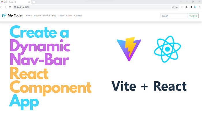
How to Create a React + TypeScript Project with Vite
If you are completely new to Reactor have any doubts about creating a new project in Reactwith Typescript using Vite, then go to the above medium tutorial or this YouTube link and set up your first Reactproject.
Step 2: Create the NavBar Component
In this step, you create a NavBar component by defining a TypeScript functional component. This component takes three props: brandName (the brand name to be displayed), imageSrcPath (the path to the brand image icon), and navItems (an array of navigation items). The component uses the Bootstrap classes for styling.
Step 3: Set Up the Component Structure
Inside the NavBar component, you create the structure of the navigation bar using Bootstrap5 classes. It includes a brand logo, a collapsible navigation menu, navigation items, and a search form. The useState hook is used to manage the selected index of the navigation items, allowing you to highlight the active item.
Step 4: Render Navigation Items
Within the ul element, the code maps over the navItems prop and generates individual navigation list items (<li>) with anchor links (<a>). The selectedIndex state helps in applying an "active" class to the selected navigation item.
Step 5: Styling with Custom CSS
The provided custom CSS in App.css is used to style the navigation bar on hover. It changes the text color and background color of the navigation links when hovered. You can customize these styles to match your design preferences.
Step 6: Import the NavBar Component
In App.tsx, import the NavBar component and define an array of navigation items. You pass the required props (brandName, imageSrcPath, and navItems) to the NavBar component, rendering it within the App component.
Step 7: Export the App Component
The App component is exported as the default export, making it the entry point for your React application.
Video Demo
Finally, the Source Code for the NavBar Component
Create a file named navbar.tsx inside the component folder and add the following code.
import { useState } from "react";
import "../App.css"

interface NavBarProps {
  brandName: string;
  imageSrcPath: string;
  navItems: string[];
}

function NavBar({ brandName, imageSrcPath, navItems }: NavBarProps) {

  const [selectedIndex, setSelectedIndex] = useState(-1);

  return (
    <nav className="navbar navbar-expand-md navbar-light bg-white shadow">
      <div className="container-fluid">
        <a className="navbar-brand" href="#">
          <img
            src={imageSrcPath}
            width="60"
            height="60"
            className="d-inline-block align-center"
            alt=""
          />
          <span className="fw-bolder fs-4">{brandName}</span>
        </a>
        <button
          className="navbar-toggler"
          type="button"
          data-bs-toggle="collapse"
          data-bs-target="#navbarSupportedContent"
          aria-controls="navbarSupportedContent"
          aria-expanded="false"
          aria-label="Toggle navigation"
        >
          <span className="navbar-toggler-icon" />
        </button>
        <div
          className="collapse
         navbar-collapse"
        id="navbarSupportedContent">
          <ul className="navbar-nav me-auto mb-2 mb-md-1">
            {navItems.map((items, index) => (
              <li
                key={items}
                className="nav-item"
                onClick={() => setSelectedIndex(index)}
              >
                <a
                  className={
                    selectedIndex == index
                      ? "nav-link active fw-bold"
                      : "nav-link"
                  }
                  href="#"
                >
                  {items}
                </a>
              </li>
            ))}
          </ul>
          <form className="d-flex me-3">
            <input
              className="form-control me-2"
              type="search"
              placeholder="Search"
              aria-label="Search"
            />
            <button className="btn btn-outline-success" type="submit">
              Search
            </button>
          </form>
        </div>
      </div>
    </nav>
  );
}

export default NavBar;
Then update the App.css with the below custom style.
/* custom.css */
  .navbar-nav .nav-item .nav-link:hover {
    color: black; /* Change to your desired text color on hover */
    background-color: #f0f0f0; /* Change to your desired background color on hover */
    /* Add any other styling you want for the hover effect */
  }
Modify the App.tsx class with the following code.
import NavBar from "./components/NavBar";
import imagePath from "./assets/your_image_icon.png";
function App() {
  let items = ["Home","Product", "Service"];
  return (
    <div>
      <NavBar
      brandName="My Brand"
      imageSrcPath={imagePath}
      navItems={items}/>
    </div>
  );
}
export default App;
In summary, this code sets up a dynamic and responsive navigation bar component for a React application. It allows you to easily customize the brand name, brand image, and navigation items. The styling is based on Bootstrap 5, and additional custom styling is provided for the hover effect. You can use this as a starting point for creating a navigation bar for your web application.
If you like this tutorial, don’t forget to subscribe to my YouTube channel and follow me on Medium.
Thank You!
Comments
Loading comments…