How to Customize mat-form-field Border Color in Angular Material (V >= 15)
Angular Material is a powerful UI framework for building web applications with Angular. One of the common requirements in web development is customizing the appearance of form fields, including changing the border color. In this article, we'll explore how to change the mat-form-field border color using Angular Material (version 15 and above).
Overview
Angular Material uses the Material Design components, and the mat-form-field is a fundamental building block for forms. To customize the border color, you can leverage CSS to override the default styles. Let's dive into the details using the provided example.
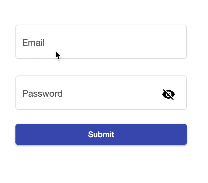
Customizing mat-form-field Border Color
In your Angular project, locate the styles file (e.g., styles.scss), and add the following CSS code to customize the mat-form-field border color:
/* Change the border color */
.mdc-text-field--outlined:not(.mdc-text-field--disabled) .mdc-notched-outline__leading,
.mdc-text-field--outlined:not(.mdc-text-field--disabled) .mdc-notched-outline__notch,
.mdc-text-field--outlined:not(.mdc-text-field--disabled) .mdc-notched-outline__trailing {
  border-color: var(--border-color) !important;
}

/* Change the border width */
.mdc-text-field--outlined:not(.mdc-text-field--disabled)
  .mdc-notched-outline
  .mdc-notched-outline__leading,
.mdc-text-field--outlined:not(.mdc-text-field--disabled)
  .mdc-notched-outline
  .mdc-notched-outline__notch,
.mdc-text-field--outlined:not(.mdc-text-field--disabled)
  .mdc-notched-outline
  .mdc-notched-outline__trailing {
  border-width: 1.5px !important;
}

/* Change the border focused color */
.mdc-text-field--outlined:not(.mdc-text-field--disabled).mdc-text-field--focused
  .mdc-notched-outline__leading,
.mdc-text-field--outlined:not(.mdc-text-field--disabled).mdc-text-field--focused
  .mdc-notched-outline__notch,
.mdc-text-field--outlined:not(.mdc-text-field--disabled).mdc-text-field--focused
  .mdc-notched-outline__trailing {
  border-color: var(--color-primary) !important;
}

/* Change the border hover color */
.mdc-text-field--outlined:not(.mdc-text-field--disabled):not(.mdc-text-field--focused):hover
  .mdc-notched-outline
  .mdc-notched-outline__leading,
.mdc-text-field--outlined:not(.mdc-text-field--disabled):not(.mdc-text-field--focused):hover
  .mdc-notched-outline
  .mdc-notched-outline__notch,
.mdc-text-field--outlined:not(.mdc-text-field--disabled):not(.mdc-text-field--focused):hover
  .mdc-notched-outline
  .mdc-notched-outline__trailing {
  border-color: var(--color-primary) !important;
}
In this example:
- The first block of code changes the default border color to
--border-color. - The second block adjusts the border width to
1.5px. - The third block alters the border color when the mat-form-field is focused.
- The fourth block modifies the border color on hover, excluding the focused state.
Make sure to replace --border-color & --color-primary with the actual variable or color you want to use for the focused and hover states.
Conclusion
Customizing the mat-form-field border color in Angular Material is achievable by leveraging CSS to override the default styles. By using the provided example, you can easily adapt and extend the styles to meet your specific design requirements. Experiment with different colors and styles to create a seamless and visually appealing form in your Angular application.
Comments
Loading comments…