I love modals because they save a lot of time required to load a new tab. In this post, we’re going to learn how to create an awesome reusable modal with React from scratch.
Photo by Jackson Sophat on Unsplash
Introduction
Modals are separate windows within a web application, usually displaying information or a confirmation box to delete some data. They constitute a core component of nearly any website that renders dynamic content and allows a user to perform CRUD (Create, Read, Update, Delete) operations on the displayed data.
Instagram is a good example, where it displays a modal component confirming that the user genuinely wants to either deactivate or delete their account.
In this tutorial, we will observe how to implement a reusable modal component in a React and TypeScript project. We will develop a Dashboard component that manages the state and a button to toggle a modal. The Modal component will also include a button to close the modal.
Step 1 — Starting the Dashboard Component
export default function Dashboard(): ReturnType<FC> {
  const [showModal, setShowModal] = useState<boolean>(false);

  function toggleModal() {
    setShowModal(!showModal);
  }

  return (
    <>
      <h1>Dashboard</h1>
    </>
  );
}
The state includes the property showModal with an initial value of false. This setup enables us to hide the modal when entering the website. When the toggleModal function is called, it will switch the modal’s state to the opposite of the current state.
With the logic now established, we can proceed to render the nicely styled button within a card view that we’ll create:
export  default  function  Dashboard(): ReturnType<FC> {

...

return (
<>
...
<div className="card">
<span>Toggle Card</span>
<button type="button" className="btn" onClick={toggleModal}>Open</button>
</div>
</>
);
}
The button accepts the React JSX attribute onClick to apply the toggleModal function and opens our modal. We will export our Dashboard to use in our App component like so:
function App() {
  return <Dashboard />;
}
Step 2 — Building the Modal Component
Let’s create a new Modal.tsx file where we create a stateless functional Modal component that accepts the necessary props: open determines if the modal should be displayed, onClose handles closing the modal, and children holds our customized content that we display in the Modal body.
interface ModalProps {
  open: boolean;
  onClose: () => void;
  children: ReactElement;
}

export default function Modal(props: ModalProps): ReturnType<FC> {
  return (
    <div
      className={`${"modal"} ${props.open ? "display-block" : "display-none"}`}
    >
      <div className="modal-main">
        <div className="modal-head">
          <h1>Modal</h1>
        </div>
        <div className="modal-body">{props.children}</div>
        <div className="btn-container">
          <button type="button" className="btn" onClick={props.onClose}>
            Close
          </button>
        </div>
      </div>
    </div>
  );
}
Our return statement simply renders a header, our customized content, and a button for the user to close the modal — which is referencing the onClose function passed down as a prop.
Furthermore, we have conditionally rendered the modal based on open prop using the ternary operator, where we set the className property to display-block if open is true, and display-none if open is false. The `${} ${}` expression inside of className allows us to declare more than one class property.
inside of our global.css (alternatively, can use index.css) we will add in the contents for styling:
.modal {
  position: fixed;
  top: 0;
  left: 0;
  width: 100%;
  height: 100%;
  background: #00000099;
}

.modal-main {
  position: fixed;
  background: white;
  width: 35rem;
  height: auto;
  top: 40%;
  left: 50%;
  transform: translate(-50%, -50%);
  display: flex;
  flex-direction: column;
  align-items: center;
  border-radius: 20px;
}

.modal.display-block {
  display: block;
}

.modal.display-none {
  display: none;
}
The .modal styling provides an overlay background over the application while a modal is present and the .modal-main styling positions our modal in the middle of the application.
Step 3 — Incorporating the Modal Component
Last step is to add the Modal component into our Dashboard component like so:
export  default  function  Dashboard(): ReturnType<FC> {
...

return (
<>
<Modal open={showModal} onClose={toggleModal}>
<div>
Main Content goes here!
</div>
</Modal>
...
</>
);
}
Here we are supplying the Modal the showModal and onClose props that we defined inside our Dashboard component. And the div tag inside of our Modal component is received as the children prop that we defined.
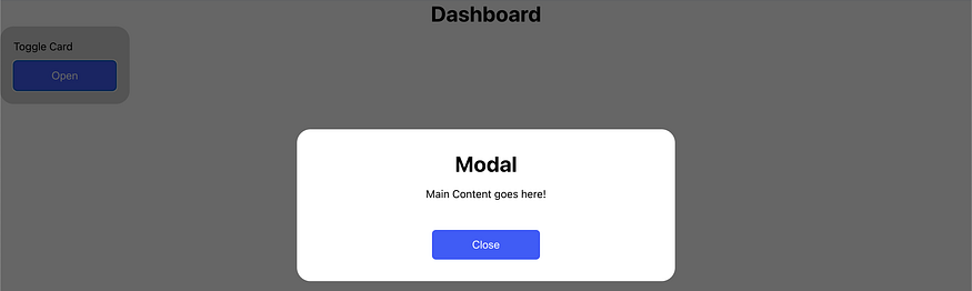
Observe how our new Modal component now opens and close.
Conclusion
In this tutorial, we learned how React along with TypeScript can be used to implement modals by passing props and functions that toggle state from one component to another.
Source Code: Github
Thanks for Reading! Before you go:
- 👏 Clap for the story and follow the author 👉
- 🔔 Follow me for more content: Twitter | LinkedIn
- ☕️ Feel free to support me :)
Comments
Loading comments…