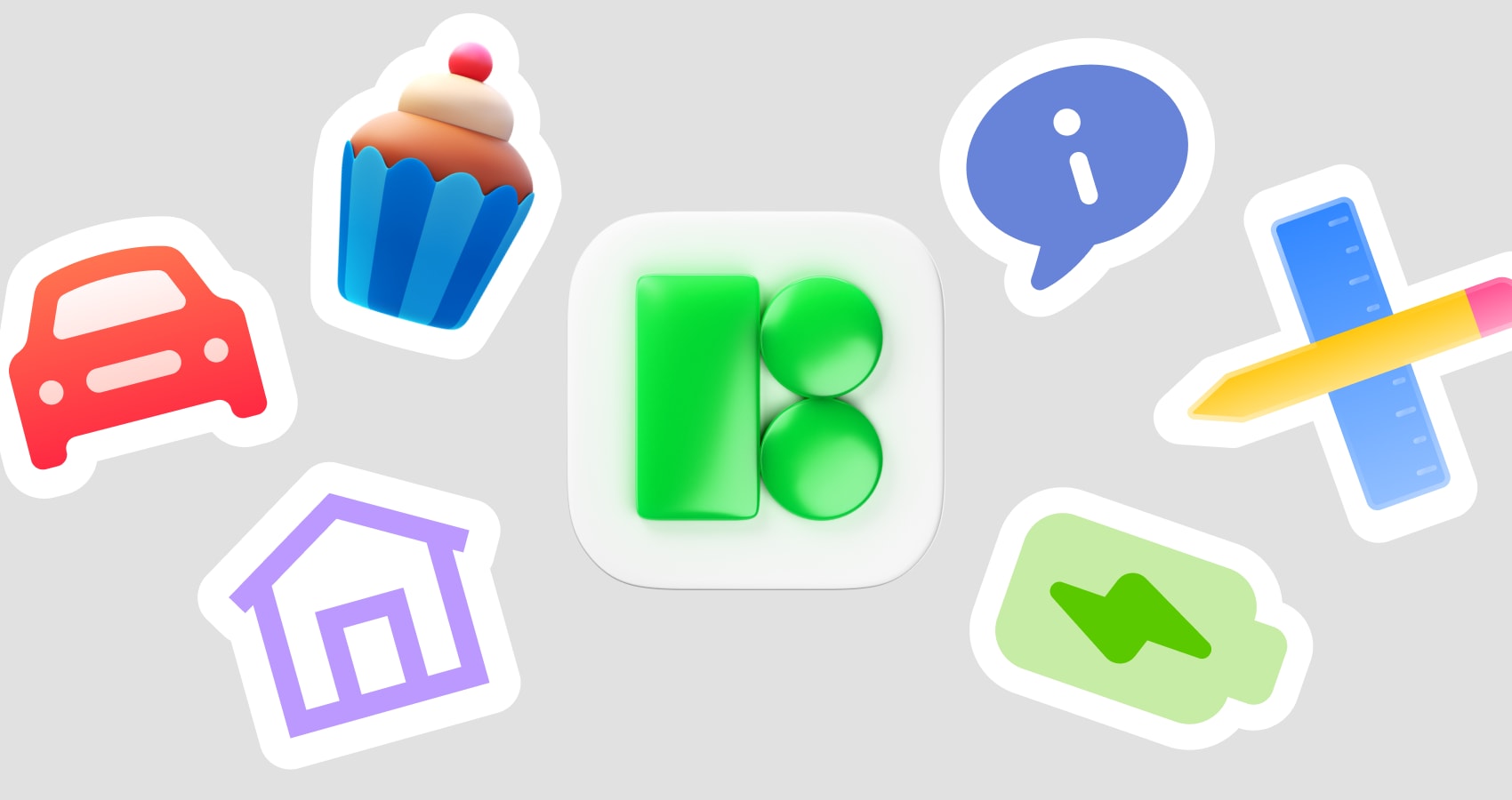
Where Icon Consistency Falls Apart
Sharing a React component library across five product teams sounds neat-until you look at the icons.
One team grabs Feather for a settings icon, another pastes a random SVG from Flaticon, a third drags a PNG into Figma and exports a slightly fuzzy asset. Stroke weights clash, corners disagree, and a single “search” icon shows up in four different styles.
Going fully custom with an in‑house icon set fixes that, but you pay for it in design hours, ongoing curation, and versioning overhead. The gap I needed to fill was simpler: one large, consistent icon source that behaves predictably inside a React component library without turning the team into an icon foundry.
That’s where Icons8 ended up fitting.
What Icons8 Actually Gives You
Icons8 offers a very large icon library with constraints that matter when you’re standardizing:
- 1,476,100+ icons, organized into 45+ coherent visual styles
- Over 10,000 icons per style pack, so most use cases stay inside a single style
- 4,500+ animated icons in multiple formats
For frontends and design systems, the key pieces are:
- Static formats: PNG up to 1600 px, SVG, PDF, plus favicon presets
- Animated formats: GIF, Lottie JSON, After Effects projects
- Platform-aware styles that match iOS, Material Design, and Windows
- Plugins for Figma, Photoshop, Illustrator, and a Mac app for drag and drop
- A web editor to recolor, tweak padding, and add strokes or text before download
One source that spans UI icons, logos, and more expressive 3D / emoji styles starts to work as a backbone library instead of yet another isolated icon pack.
Scenario 1: Building A Shared Icon Set For React
When we formalized our React icon components, the workflow went like this.
We committed to a single outline style for the main web UI. Icons8 ships several tightly curated packs, like an iOS 17 outlined set and a Material outlined set. Each contains thousands of icons, enough to cover navigation, settings, commerce, onboarding, and error states without mixing styles.
Practical steps:
- In Icons8 search, we filtered to one style and static icons only.
- A “System icons” collection became the home for core primitives: arrows, search, close, checkmarks, and a standard shopping cart icon.
- Bulk recolor on the collection aligned everything to our primary icon color token.
- SVGs exported from the collection, with simplified SVG turned off wherever we needed editable paths.
- Those SVGs went through our icon pipeline, which generates React components and enforces a shared viewBox and sizing convention.
Visual consistency improved, but the real win was scale. A single style pack with 10,000+ icons meant we could cover current and future needs without constantly paging design. When a new product team needed a “security policy” icon, they stayed in the same style and color system and skipped the request queue.
Designers saw the same source. The Figma plugin pointed at the same styles and icons, so both sides of the stack literally pulled from one library.
A Midweek Icon Fire Drill
One Tuesday afternoon, the billing team pinged me. They were shipping a promotions UI in three days and had already filled the mockups with mismatched icons.
Our designer, Priya, opened Icons8 in the browser, filtered to our house style, and spun up a “Billing” collection. She searched “invoice”, “discount”, “wallet”, “card”, and used live recolor in the search results to preview icons in our brand color on light and dark backgrounds.
Once the set felt right, she:
- Used the in-browser editor to add consistent padding so everything sat cleanly in a 24 px grid
- Nudged one arrow icon to line up with our navigation pattern
- Exported the full collection as SVGs and sent me the share link
I pulled the new SVGs, regenerated our React icon bundle, and under an hour later the billing team had consistent icons in both Figma and the running app. No new Illustrator doc, no debate over stroke thickness.
Scenario 2: Adding Motion Without A New Toolchain
We also started leaning on Icons8 for lightweight animated feedback.
For a recent onboarding flow, product asked for animated success and loading icons. Instead of inventing a motion language from scratch, we:
- Filtered Icons8 to animated icons and picked a style close to our static set.
- Downloaded Lottie JSON for the web app and matching GIFs for docs and emails.
- Handed the After Effects project files to our motion designer so they could tweak easing and timing before final export.
One small team shipped motion that still felt like part of the same icon family, and we didn’t bolt on a separate animation library or pipeline.
How Icons8 Compares To Other Approaches
From a React library maintainer’s point of view:
- In-house icons
Great when you need a fully proprietary look, but you’re signing up to design and maintain thousands of icons as features grow. Icons8 cuts that backlog with a huge catalog in consistent styles, at the cost of some uniqueness.
- Open source packs like Feather or Heroicons
Solid choice if your product fits cleanly into one of their smaller sets. The tradeoff comes in scope and variety. Icons8 offers many more styles and far deeper coverage inside each style, which matters when multiple teams ship very different features.
- Marketplaces such as Flaticon or Noun Project
In my experience these shine for one-off illustrations. For a multi-team design system, mixing authors introduces uneven line weights, proportions, and metaphors. Icons8 filters by in-house styles and gives style-level control, which plays much nicer with a shared React library.
Icons8 doesn’t magically fix bad design decisions, but when the main headache is “too many mismatched icons from too many places”, one structured source helps a lot.
Where Icons8 Is The Wrong Fit
I’d skip Icons8 as the core of a system when:
- Your brand identity depends on fully custom iconography that no one else can license.
- You can’t pay for a plan and also can’t add attribution, since the free tier usually needs a link back to Icons8 for PNG use.
- Every icon must be hand-tuned to a very specific in-house grid and stroke spec, beyond what recolor and padding tweaks can hit.
Icons8 sits closer to a polished, configurable base library than a bespoke brand asset program.
Practical Tips From Real Use
A few habits helped keep things sane across teams:
- Pick styles deliberately
Choose one core style for UI chrome. Save expressive styles like 3D Fluency or Emoji for marketing, onboarding, or empty states so products don’t feel chaotic.
- Use collections as your “source of truth”
Mirror your React icon categories (navigation, commerce, content, status) as Icons8 collections. That makes bulk export, review, and later additions straightforward.
- Normalize icons before integrating
In the editor, standardize padding and backgrounds before download so your shared `<Icon>` component can assume a consistent canvas.
- Lean on platform-specific styles
When building platform-native experiences, those Apple, Android, and Windows-compliant styles keep semantics consistent while matching OS expectations.
Used this way, Icons8 helped five React products share one visual language without turning our team into full-time icon designers or juggling half a dozen fragmented packs.
Comments
Loading comments…