Hello guys, in this tutorial I will try to teach how to create a custom dropdown in SwiftUI. At the bottom of that blog, you can get the complete code of the following blog. Let’s get started.
First, create the new code project by selecting the SwiftUI framework and then follow along with me.
Step-1
First, create the new file called DropDownPicker and then create an enum type called DropDownPickerState.
enum DropDownPickerState {

case top

case bottom

}
We will handle the direction of the dropdown menu by using this enum type.
Step-2
Now create the following properties inside the DropDownPicker.
@Binding var selection: String?

var state: DropDownPickerState = .bottom

var options: [String]

var maxWidth: CGFloat = 180

@State var showDropdown = false

@SceneStorage("drop_down_zindex") private var index = 1000.0

@State var zindex = 1000.0
- selection: will give the selected option value
- state: will tell us what should be the direction of dropdown
- options: list of options that will show in the dropdown
- maxWidth: width of the dropdown field
- showDropdown: will toggle the dropdown on and off
The last two parameters are used for showing the dropdown field on the top of the screen. Suppose we show multiple dropdown fields on the same screen and when the dropdown opens it will appear on the back of the other fields so for that reason we are handling the zindex.
By default, the zindex of every dropdown field will be 1000, and when the dropdown menu shows on the screen we will increase that and then that dropdown will remain at the top.
Step-3
Now create a GeometryReader and give width and height to it. I will be the frame of the dropdown field when it is not active. Also, give the zindex to this. I will show you how the zindex increase later in this blog.
Create a VStack inside the GeometryReader and give some properties to this like
- Background color
- Corner Radius
- Overlay for creating a circular border
- And some frame
If the state value is .top then the alignment of the frame is .bottom otherwise will be .top
var body: some View {

GeometryReader {

let size = $0.size

VStack(spacing: 0) {

}

.clipped()

.background(.white)

.cornerRadius(10)

.overlay {

RoundedRectangle(cornerRadius: 10)

.stroke(.gray)

}

.frame(height: size.height, alignment: state == .top ? .bottom : .top)

}

.frame(width: maxWidth, height: 50)

.zIndex(zindex)

}
Step-4
Now create a design for the un-active dropdown. For that first create the HStack and that will contain some leading text and trailing chevron.down or chevron.up icon on the base of state value which we have created on the top of that view by default the state value is .bottom.
On the middle of text and icon, we are using Spacer() which will push these two on the sides of the screens as available width.
Apply some modifiers like padding, frame, background, contentShape, and onTapGesture.
On tap gestuer we will toggle the showDropdown value and also will increase the index and put that into the zindex variable which will put that dropdown on the top of the every view
We are also giving the index to the HStack which should be greater than the OptionsView.
HStack {

Text(selection == nil ? "Select" : selection!)

.foregroundColor(selection != nil ? .black : .gray)

Spacer(minLength: 0)

Image(systemName: state == .top ? "chevron.up" : "chevron.down")

.font(.title3)

.foregroundColor(.gray)

.rotationEffect(.degrees((showDropdown ? -180 : 0)))

}

.padding(.horizontal, 15)

.frame(width: maxWidth, height: 50)

.background(.white)

.contentShape(.rect)

.onTapGesture {

index += 1

zindex = index

withAnimation(.snappy) {

showDropdown.toggle()

}

}

.zIndex(10)
Step-5
Now create the OptionsView which will show as a dropdown. Create VStack and apply transition to it if the state is equal to the .top then the transition direction will be .bottom otherwise will be .top.
Now iterate the options by using ForEach and then create HStack for every element. This HStack will contain the option value and checkmark icon. If the option is selected then checkmark icon will show otherwise it will hide. Also if the option is selected then the color will be .primary otherwise the color will be the .gray.
When selecting the option then put that value into the selection and hide the dropdown by toggling the showDropdown.
func OptionsView() -> some View {

VStack(spacing: 0) {

ForEach(options, id: \.self) { option in

HStack {

Text(option)

Spacer()

Image(systemName: "checkmark")

.opacity(selection == option ? 1 : 0)

}

.foregroundStyle(selection == option ? Color.primary : Color.gray)

.animation(.none, value: selection)

.frame(height: 40)

.contentShape(.rect)

.padding(.horizontal, 15)

.onTapGesture {

withAnimation(.snappy) {

selection = option

showDropdown.toggle()

}

}

}

}

.transition(.move(edge: state == .top ? .bottom : .top))

.zIndex(1)

}
Step-6
Now put the following line on the top and inside the main VStack.
if state == .top && showDropdown {

OptionsView()

}
Put the following line on the bottom and inside the main VStack.
if state == .bottom && showDropdown {

OptionsView()

}
When the state is .top and showDropdown is equal to the true then the dropdown will show on the top otherwise will show on the bottom.
Final Step — 🚀 🚀 🚀 🚀 🚀
Now its time to use that in the ContentView to show the update. Use the following code in the ContentView and then run the code.
struct ContentView: View {

@State var selection1: String? = nil

var body: some View {

DropDownPicker(

selection: $selection1,

options: [

"Apple",

"Google",

"Amazon",

"Facebook",

"Instagram"

]

)

}

}
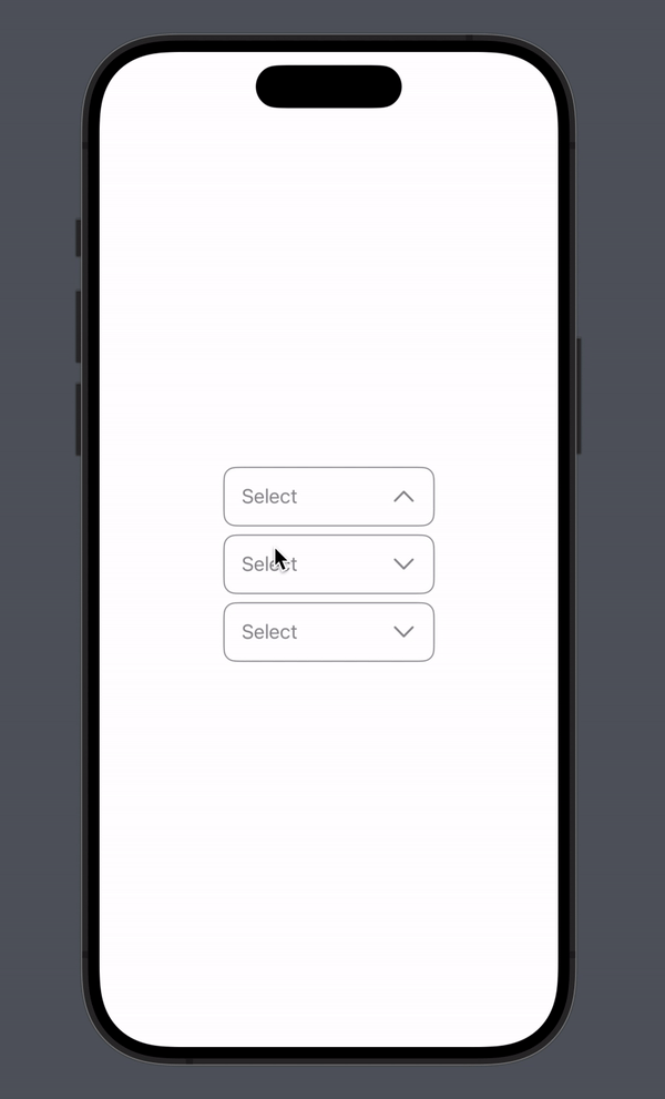
Then you will see the following output.

Hope you guys understand how to create a dropdown menu using SwiftUI. Thanks for reading this.😊 😊 😊 😊 😊 😊 😊 😊 😊 😊
Get Complete Code
import SwiftUI

struct ContentView: View {

@State var selection1: String? = nil

var body: some View {

DropDownPicker(

selection: $selection1,

options: [

"Apple",

"Google",

"Amazon",

"Facebook",

"Instagram"

]

)

}

}

enum DropDownPickerState {

case top

case bottom

}

struct DropDownPicker: View {

@Binding var selection: String?

var state: DropDownPickerState = .bottom

var options: [String]

var maxWidth: CGFloat = 180

@State var showDropdown = false

@SceneStorage("drop_down_zindex") private var index = 1000.0

@State var zindex = 1000.0

var body: some View {

GeometryReader {

let size = $0.size

VStack(spacing: 0) {

if state == .top && showDropdown {

OptionsView()

}

HStack {

Text(selection == nil ? "Select" : selection!)

.foregroundColor(selection != nil ? .black : .gray)

Spacer(minLength: 0)

Image(systemName: state == .top ? "chevron.up" : "chevron.down")

.font(.title3)

.foregroundColor(.gray)

.rotationEffect(.degrees((showDropdown ? -180 : 0)))

}

.padding(.horizontal, 15)

.frame(width: 180, height: 50)

.background(.white)

.contentShape(.rect)

.onTapGesture {

index += 1

zindex = index

withAnimation(.snappy) {

showDropdown.toggle()

}

}

.zIndex(10)

if state == .bottom && showDropdown {

OptionsView()

}

}

.clipped()

.background(.white)

.cornerRadius(10)

.overlay {

RoundedRectangle(cornerRadius: 10)

.stroke(.gray)

}

.frame(height: size.height, alignment: state == .top ? .bottom : .top)

}

.frame(width: maxWidth, height: 50)

.zIndex(zindex)

}

func OptionsView() -> some View {

VStack(spacing: 0) {

ForEach(options, id: \.self) { option in

HStack {

Text(option)

Spacer()

Image(systemName: "checkmark")

.opacity(selection == option ? 1 : 0)

}

.foregroundStyle(selection == option ? Color.primary : Color.gray)

.animation(.none, value: selection)

.frame(height: 40)

.contentShape(.rect)

.padding(.horizontal, 15)

.onTapGesture {

withAnimation(.snappy) {

selection = option

showDropdown.toggle()

}

}

}

}

.transition(.move(edge: state == .top ? .bottom : .top))

.zIndex(1)

}

}
Comments
Loading comments…