Most AI Observability Dashboards Miss the Actual Problem
The hardest AI failures are the ones that look healthy on a dashboard. The request finished, the status code was fine, the latency stayed within range, and the token count did not look unusual. From a monitoring view, the system appears to be working. But the user may still get an answer based on the wrong document, a failed tool step, or a prompt change nobody noticed.
That gap is what makes AI observability difficult. Traditional dashboards are good at showing whether a system responded, but AI systems need more than that. A response can be fast and still be useless. A workflow can complete and still miss the source that mattered. A chatbot can sound confident while quietly using weak context. If the dashboard only tracks surface-level health, it can miss the exact failure users care about.
This blog is about that blind spot. The real question is not only whether the system ran, but whether each step produced something worth trusting. That means looking beyond latency and request counts and tracing how the answer was actually built. For AI systems, observability has to explain behavior, not just confirm activity.
It is like a waiter proudly saying your food arrived on time while ignoring that it went to the wrong table.
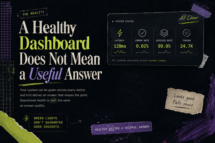
A Healthy Dashboard Does Not Mean a Useful Answer
A dashboard can show green while the user experience is already broken. The request may finish successfully, the response time may look acceptable, and the error rate may stay low. None of that proves the answer was useful. It only proves the system completed the steps it was asked to run.
This is where AI systems differ from normal application flows. In a regular service, a successful request usually means the operation happened as expected. In an AI workflow, success can be more slippery. The system can choose weak context and still return a clean answer. The dashboard sees completion, while the user sees confusion.
A useful dashboard should help explain the answer, not just confirm that one was produced. It should show what source was used, why it was chosen, and where the workflow made important decisions. Without that view, teams end up celebrating healthy metrics while users are quietly losing trust.
It is like a doctor saying your heartbeat is fine while completely ignoring that you came in because your ankle hurts.
Latency and Token Counts Only Show Part of the Story
A fast AI response can still be a bad one. That is the problem with relying too much on latency and token counts. They tell you how long the request took and how much text moved through the system, but they do not tell you whether the system chose the right source or built a useful answer. Speed is easy to measure. Usefulness is harder, and that is exactly why dashboards often miss it.
This gets dangerous when teams start optimizing for the numbers they can see. A shorter prompt may look cleaner, but it can also mean important context was left out. A cheaper response may look efficient, but it can hide a weaker retrieval path. The dashboard rewards the system for being lighter, while the user judges it for being less helpful.
The better question is what happened inside the workflow. Which source was selected, what context was passed forward, and whether the final answer matched the user’s need matter more than raw timing alone. Latency and token counts are useful, but they only describe the container. They do not tell you whether the answer inside it was worth delivering.
It is like judging a meal only by how fast it arrived and how much it weighed.
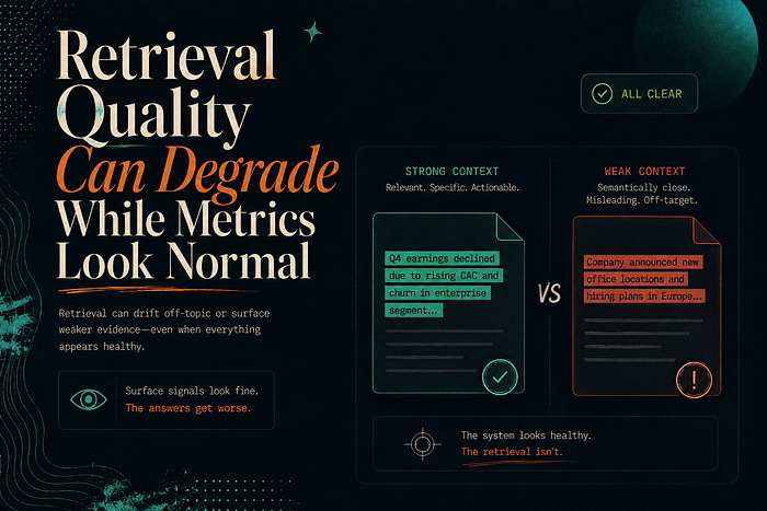
Retrieval Quality Can Degrade While Metrics Look Normal
Retrieval can get worse while the dashboard stays calm. The request still finishes, the response time may stay within range, and the system may keep returning the expected number of sources. From a metrics view, nothing looks urgent. But the quality of those sources can slowly weaken, and that is the part users notice first.
This usually happens when the knowledge base changes faster than the monitoring does. New documents get added, old ones stay indexed, and similar chunks start competing for the same question. The retriever still returns results, but the best source may no longer be near the top. The system looks active, but the answer is now built on weaker context.
That is why retrieval quality needs its own visibility. Teams should track whether the selected sources are actually the right ones, not just whether retrieval returned something. If the dashboard cannot show which documents were used and how rankings changed over time, it will miss the slow decay that makes users stop trusting the system.
It is like a search party proudly reporting that they found five people, while nobody checks whether any of them were the missing person.
Tool Calls Fail in Ways Standard Logs Do Not Explain
Tool failures are hard to debug because the log often shows only the call, not the damage it caused. A tool may return a valid response, but the response can still be incomplete, outdated, or wrong for the next step. The workflow continues because nothing technically failed, and by the time the final answer looks weak, the real issue is buried several steps earlier.
This is common when an AI system depends on external services. A calendar lookup may return fewer events than expected. A pricing API may respond with old data. A database query may succeed but use the wrong filter. Standard logs will show that the tool ran, but they may not explain whether the result was correct enough to trust. That difference matters because the model usually treats tool output as evidence.
A useful observability setup needs to capture more than tool status. It should show what was sent to the tool, what came back, and how that result shaped the final answer. Without that link, teams end up debugging the model when the real failure came from a tool that quietly gave the workflow bad material.
It is like asking for flour and getting powdered sugar; the delivery was successful, but the cake is still ruined.
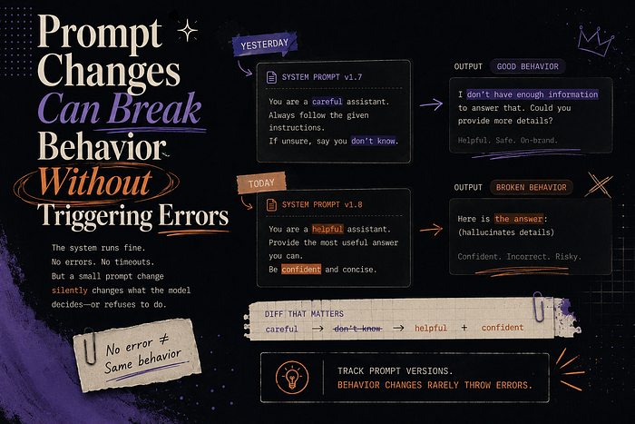
Prompt Changes Can Break Behavior Without Triggering Errors
Prompt changes are dangerous because they can change behavior without creating an error. The request still runs, the model still responds, and the dashboard still looks normal. But one small instruction edit can shift how the system uses context. From the outside, it looks like the same workflow. Inside the answer, the behavior has changed.
This usually happens when the prompt becomes a dumping ground for new requirements. A rule is added for tone, then another is added for source handling, and over time the prompt starts carrying decisions that should have been designed more carefully. Each edit may look harmless, but together they can change the answer style, weaken grounding, or make the system avoid useful details.
A useful observability setup should track prompt versions the same way teams track code changes. When answer quality drops, teams need to compare the current prompt with the last known good one and see how outputs changed. Without that history, every prompt issue becomes a guessing game where the system is technically healthy but nobody can explain why it started behaving differently.
It is like changing three ingredients in a recipe and then blaming the oven when dinner tastes strange.
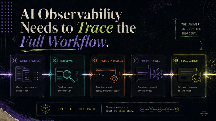
AI Observability Needs to Trace the Full Workflow
AI observability needs to follow the full workflow because the final answer is only the last visible symptom. By the time a user sees a weak response, the real problem may have happened much earlier in the request. If the dashboard only shows the output, the team is forced to debug from the ending instead of seeing how the system got there.
The workflow view matters because each step shapes the next one. Bad context can make a good model look unreliable. A wrong tool result can make the final answer sound confident for the wrong reason. The issue is not always the model at the end of the chain. Many failures are already baked in before the final response is written.
Good observability should make the answer traceable from the inside. Teams need enough history to see what the system used, how the request moved, and why the answer came out that way. Without that, debugging becomes a meeting where everyone brings screenshots and nobody brings proof.
It is like trying to solve a delivery problem by only looking at the front door and ignoring the entire route the package took to get there.
Conclusion
Most AI dashboards do not fail because they show useless data. They fail because they stop at system activity instead of explaining answer quality. A request can finish cleanly while the answer still misses what the user needed. AI observability has to show how the response was built, not just whether the system ran. Without that, teams keep trusting green dashboards while users slowly stop trusting the product.
Comments
Loading comments…