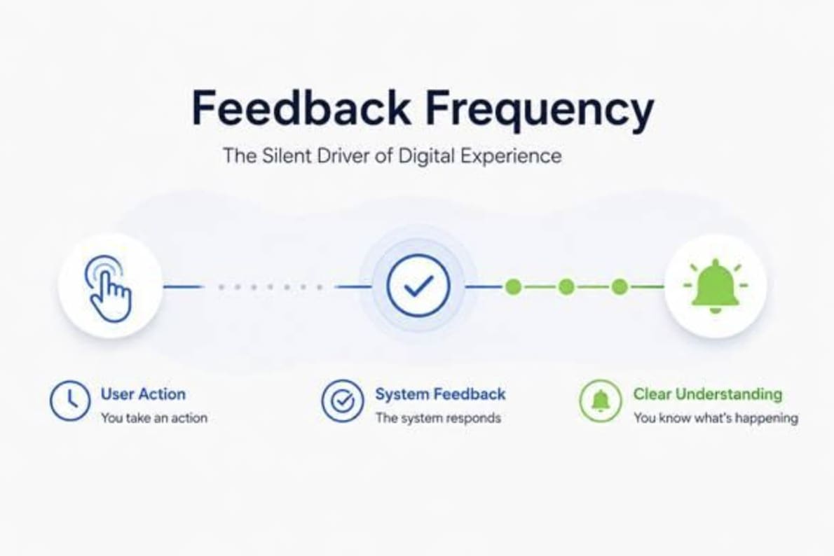
Most product interfaces do not fail because users cannot find a button. They fail earlier, in the moment between action and response. A tap, click, swipe, upload, or level attempt should all provide the user with enough information to keep the next move clear.
A 2021 open-access study on gamification in mobile apps found that game elements can support engagement when they satisfy competence, autonomy, and relatedness. That matters because feedback is not decoration layered on top of a feature. It is the way a product teaches the user what a feature does. Status messages and contextual signals help people understand systems faster, which is critical for retaining users.
Digital Games Make Feedback Frequency Visible
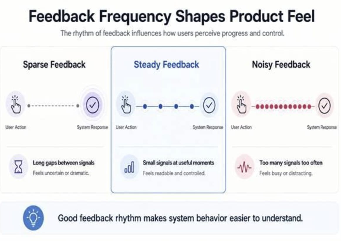
Digital games are useful design examples because their feedback loops are exposed. You do something, the system answers, and the timing of that answer shapes how the experience feels. Some games create dense feedback through sounds, visual bursts, score movement, or progress markers. Others hold feedback for a larger reveal.
Slot games make the concept especially easy to observe because volatility describes the pattern of outcomes, not just the average over time. A category such as this page of low volatility online slots is built around more frequent, smaller outcomes, which makes the rhythm of feedback easier to read than formats that emphasize wider swings. For product designers, the takeaway is not to copy the surface mechanics of slots into unrelated products. It is to study how frequency and size work together.
A frequent signal can make a system feel active and understandable. A less frequent signal can create anticipation, but it also leaves more space between action and confirmation. In dashboards, learning tools, onboarding flows, and progress trackers, this same tradeoff appears constantly. Low volatility online slots give a real-world example of a feedback pattern where the user receives regular signals, making cadence, distribution, and perceived momentum easier to separate.
Once that distinction is clear, this short volatility explainer turns the idea into plain language. It separates hit frequency from outcome size and clarifies why volatility and RTP are not the same concept. For product-minded readers, the value is the vocabulary: cadence, distribution, swing, and feedback size.
A common design mistake is treating every response as equally useful. Users do not need a celebration for every micro-action. They need the system to reveal the right amount of feedback. A save confirmation removes uncertainty. A progress bar gives a believable sense of movement. A badge works when it marks a meaningful threshold.
Feedback frequency becomes a product decision when teams ask what the user is trying to understand. In a code editor, fast feedback supports correction because the user is working inside a tight loop. In a creative tool, feedback may need to be quieter because an interruption can break concentration. In a course platform, regular feedback keeps learners oriented.
This is why product metrics can flatten the discussion. A feature may increase clicks while making the experience feel busier. Another feature may reduce visible activity while making the system feel calmer and more competent. The question is not simply whether users interact more. It is whether each interaction leaves them feeling clearer.
Cadence Has a Personality
Every product has a feedback personality. Some products feel calming. Some feel intense. Some feel precise. Some feel vague. Users may not describe it that way, but they sense it. A finance dashboard that updates too often may feel unstable. A delivery tracker that updates too slowly may feel abandoned.
The best cadence often sits between silence and noise. It gives enough confirmation to maintain trust, enough progress to keep orientation, and enough restraint to avoid tiring the user. This is especially important in products built around repeated actions, where the feedback pattern becomes part of the product’s identity.
A useful mental model is simple: frequency tells users that the system is alive, size tells them how much the moment matters, and timing tells them whether the product understands their attention. Those three variables shape the felt experience before interface polish or feature depth.
Build the Rhythm Before You Polish the Screen
Good feedback design starts with respect for attention. The question is not how to make the product feel busier. The question is how to make it easier to read. A useful signal should reduce doubt, mark progress, or sharpen the next decision.
This is where engineers, designers, and product managers meet on common ground. Engineers understand system state. Designers understand perception. Product managers understand user intent. Feedback frequency turns those perspectives into one shared decision: when should the product speak, how loudly, and what should the user understand afterward?
The strongest products have timing that matches the task. They know when a tiny signal is enough, when a bigger moment should land, and when silence protects focus. That rhythm is part of how users decide whether a system feels reliable and worth returning to, a point supported by 2025 open-access research showing that simpler immediate feedback can improve learning confidence when it matches the task at hand.
Comments
Loading comments…